Book Categories:
Wait, don't go!
We have a special offer just for you!
Get 20% off your next purchase.

Book Categories:

We have a special offer just for you!
Get 20% off your next purchase.
A library, study, or reading room is not merely a place to store books. It is an intellectual environment. Its atmosphere shapes concentration, reflection, and the way in which books are encountered. For that reason, the art chosen for such a space should not be treated as an afterthought or a decorative filler. Good art in a reading room does more than occupy walls. It establishes tone, supports the character of the collection, and gives visual form to the values of the space itself. Choosing it well requires more than matching colors to furniture. It requires attention to mood, scale, subject, and cultural coherence.
The first question to ask is what kind of room you want to create. A reading room can feel scholarly, intimate, contemplative, severe, modern, historical, or quietly luxurious. Art should reinforce that identity rather than confuse it. If the room is intended to support serious study, overly loud or visually aggressive works may interrupt concentration rather than deepen it. If the room is designed as a place of retreat and reflection, art with calm structure, subtle detail, or historical resonance will often prove more suitable than pieces chosen only for impact. The best selection begins not with the object alone, but with the function and temperament of the space.
Scale is one of the most important and most frequently neglected considerations. A library wall lined with bookshelves leaves less visual room than an open living room, and this changes how art should behave. Oversized works can dominate the room too aggressively, while art that is too small may disappear into the visual density of shelving, bindings, and furniture. A reading room often benefits from works that are moderate in scale but strong in presence—pieces that can hold attention quietly rather than demand it theatrically. Proportion matters because a study is not a gallery in the public sense. It is a private environment in which visual balance must coexist with intellectual use.
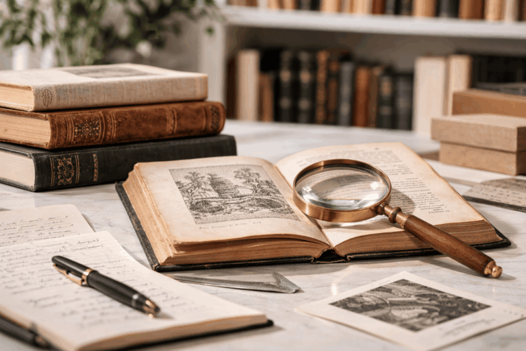
Subject matter matters as well. Art in a library does not need to depict books, writers, or literal scenes of reading, but it should feel conceptually at home among them. Portraits, landscapes, architectural studies, engravings, botanical prints, maps, abstract compositions with disciplined structure, and works on paper with historical character often suit such spaces particularly well. What unites these choices is not a single genre, but a certain compatibility with thought. A reading room rarely benefits from purely decorative images without inner weight. The strongest works offer visual pleasure while also sustaining repeated contemplation. They reward return, just as good books do.
Material and medium also deserve attention. Works on paper often feel especially natural in libraries because they share an affinity with books, manuscripts, and print culture. Etchings, lithographs, engravings, drawings, and archival prints can be exceptionally effective, particularly when framed with restraint. Paintings can also work beautifully, but in a reading room they often succeed best when their scale, palette, and surface presence are carefully judged. Sculpture, if used, should be chosen with even more caution. A study benefits from objects of concentration, not visual congestion. The room must remain legible as a place for reading rather than become crowded by competing statements.
Color is a subtler matter than many assume. The goal should not be strict matching, but tonal relationship. In rooms with wood, leather, cloth bindings, and natural materials, art with overly synthetic or harsh color may feel alien. Conversely, an entirely muted interior may benefit from carefully placed contrast. The key is not to eliminate visual energy, but to regulate it. A reading space should remain calm without becoming lifeless. Art can introduce depth, warmth, and vitality, but it should do so in a way that allows the eye to rest rather than remain under constant pressure.
Historical dialogue is another important principle. If a library contains antiquarian books, first editions, or scholarly volumes, the art in the room can either enrich or diminish the intellectual atmosphere. Works with historical depth—whether genuinely old or thoughtfully contemporary—often create a stronger relationship with books than generic decorative pieces do. This does not mean the room must become antique in style. A contemporary study can be beautifully paired with modern art. But even then, the work should possess seriousness of form or concept. The mistake is not modernity; the mistake is superficiality.
One should also consider how art and books interact spatially. In some rooms, a single strong work placed above a writing desk can serve as the visual center. In others, smaller works arranged between shelves or beside a reading chair create a more intimate rhythm. Empty space should not be feared. A library overfilled with both books and art can feel oppressive rather than cultivated. Good placement allows each work room to breathe. The reading room should feel composed, not crowded.
Finally, art in such a room should reflect the collector, not merely the decorator. A study gains authority when its contents appear selected rather than assembled according to fashion. The right work may refer to a subject you read deeply, a period you study, a landscape that matters to you, or a visual tradition that resonates with the books you collect. This personal relation is what gives the room identity. Without it, even expensive art may feel generic.
To choose art for a library, study, or reading room is therefore to make a decision about intellectual atmosphere. The best works do not interrupt the room’s purpose; they complete it. They add beauty, but also gravity, continuity, and presence. In a well-formed reading space, books and art do not compete. They speak to one another—and together they shape a room in which thought can properly take place.